THE GUEST HOUSE CHRONICLES ~ Chapter Four

SHE’S FINALLY FINISHED
Hello again. Some time has passed since our last update on the Lyon Design Lab guest house and we have finally completed the project. Yes - it has been almost a year on this journey, but when you’re juggling multiple projects, things take time.
Anyone who has been through this process will tell you that all projects come to a point where the finish line is in view, but there are still one thousand little details that keep you feeling like you’re running in place and can only be conquered with time and patience. But, alas, here we are, one thousand details later, to share the final result.
To get a sense of where we started and where we’ve been, here’s a summary of the first three chapters and a link to each article.
Laying the Groundwork
In Chapter One of The Guest House Chronicles, we shared the architectural plans and some initial renderings and ideas for the interior design. We provided a full description of what we’re trying to accomplish with this project.
In Chapter Two of The Guest House Chronicles, the construction journey began with the earthy scent of freshly turned soil as the foundation was laid. Then the framing took shape, and oh so quickly(!), giving three dimensions to the structure. At this point, we were able to see the form and presence of the structure on the property.
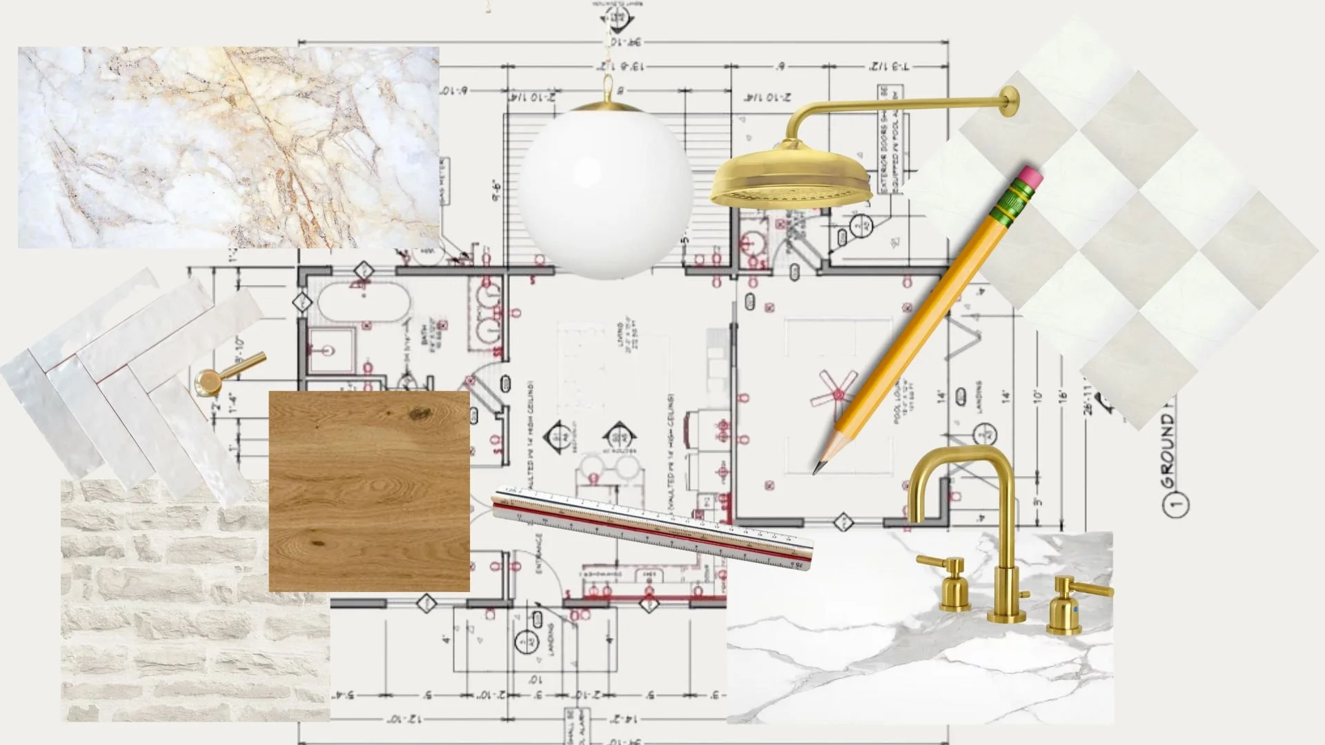
In Chapter Three of the Guest House Chronicles, we took you through our design process. We shared our objectives for each space, our considerations for finishings, and our struggles with making decisions.
THE MINI GREAT ROOM


The main room of this little house has a big lift. We wanted the kitchen to be substantial enough for real cooking and also be able to accommodate eating while sharing space with the living area. It was important to us to define the spaces but keep everything open. It’s easy with a “small, great room” for areas to feel jammed or disjointed. With the wood floors throughout, the small but mighty island, and the shelving wall for TV, the spaces in the great room feel intentional yet open.
We are thrilled with how the skylights, glass French doors to the bedroom, sliders, and windows bathe the room in natural light. The actual floor area is less than 300 square feet, but the room feels much larger. The high ceilings give the illusion of more floor space.
THE KITCHEN


In the kitchen we went with a combination of oak and white cabinets. Our plan was to keep the palette quiet, but warm, and the white oak floors blend perfectly with the cabinetry.
We added the brick wall to bring in an old world feel and just the right touch of texture and personality to the space. And, the bricks do just that.
Our initial plan was to paint the brick wall white, so everything blended. But after the grout was done, we fell in love with the unique look of the brick and the color it brought to the room. So, we left it as is. Paint can always be added, but for now, we like how the colors in the brick add a rustic warmth to the room.
The Lumataj Quartz from MSI countertops add depth, but keep the palette soft. They are definitely our new favorite quartz color and we have so many ideas for how we want to use them in future projects.

THE BEDROOM

It’s a basic little sleeping quarters, but it’s calm and lovely. Again, since we were limited with space, there was only one place for a headboard and we designed the windows and lighting around that placement. A great architect once told me that she always tries to get natural light coming in from three directions in every room. This tiny bedroom has a natural light source on three of its four walls and this makes the room feel spacious and airy.
We decided on glass double doors for the bedroom so that the great room could enjoy the light coming in from the windows on the South side bedroom wall as well, and this contributes to the spacious feel of the great room.

THE BATHROOM
In a prior post we shared the struggle over choosing a design that would make a statement and showcase creativity versus going with something more subdued and calming to harmonized with this little home. We went with the latter and the result is an inviting spa-like space.


We made the decision relatively early on to have just a single sink, rather than a double sink vanity and it really helps the bathroom look open and calm. Sometimes it makes sense to forego the little extras to honor the space you have. Instead of checking off an item on the “features list”, we try to ask whether the element in question really adds to the space. Never do something just because you can.
POOL LOUNGE & BATH
This guest house has what we call a “pool lounge.” Our objective was to have a room that could be enjoyed by the inhabitants of the main house while using the pool. But we wanted to preserve the privacy and separation of the guest house to accommodate the future possibility of a mother-in-law or tenant living in the unit. Accordingly, the pool lounge can be closed off from the main living area of the guest house by a secret door (see below).


The pool lounge is designed for tv-watching and cooling off inside. It’s an extension of the outside living area and features a 14-foot accordion door that opens up to the pool patio. One can go straight from the hot tub to the lounge or outdoor shower for a rinse.


GRATITUDE
We loved working on this project and, though the vision evolved significantly over the past year, we are happy with the outcome. Thank you for joining us on this journey and thanks to Charlie Melvin and his crew at Cali ADU for all of their patience and hard work! Now… let’s do it again!